高島平PROJECT
2015
東京都板橋区
共同住宅|改修
1058.73㎡(24.34㎡ renovated)
デザイン監修
Overview
限られた予算で、建物の第一印象を整え直すエントランスのバリューアップ
東京都板橋区に建つ、学生用共同住宅のバリューアップ計画。
住戸内は入退去時の原状回復工事によって比較的良好な状態を保っていた一方で、建物外観や共用部には経年による劣化が目立つ状態となっていた。
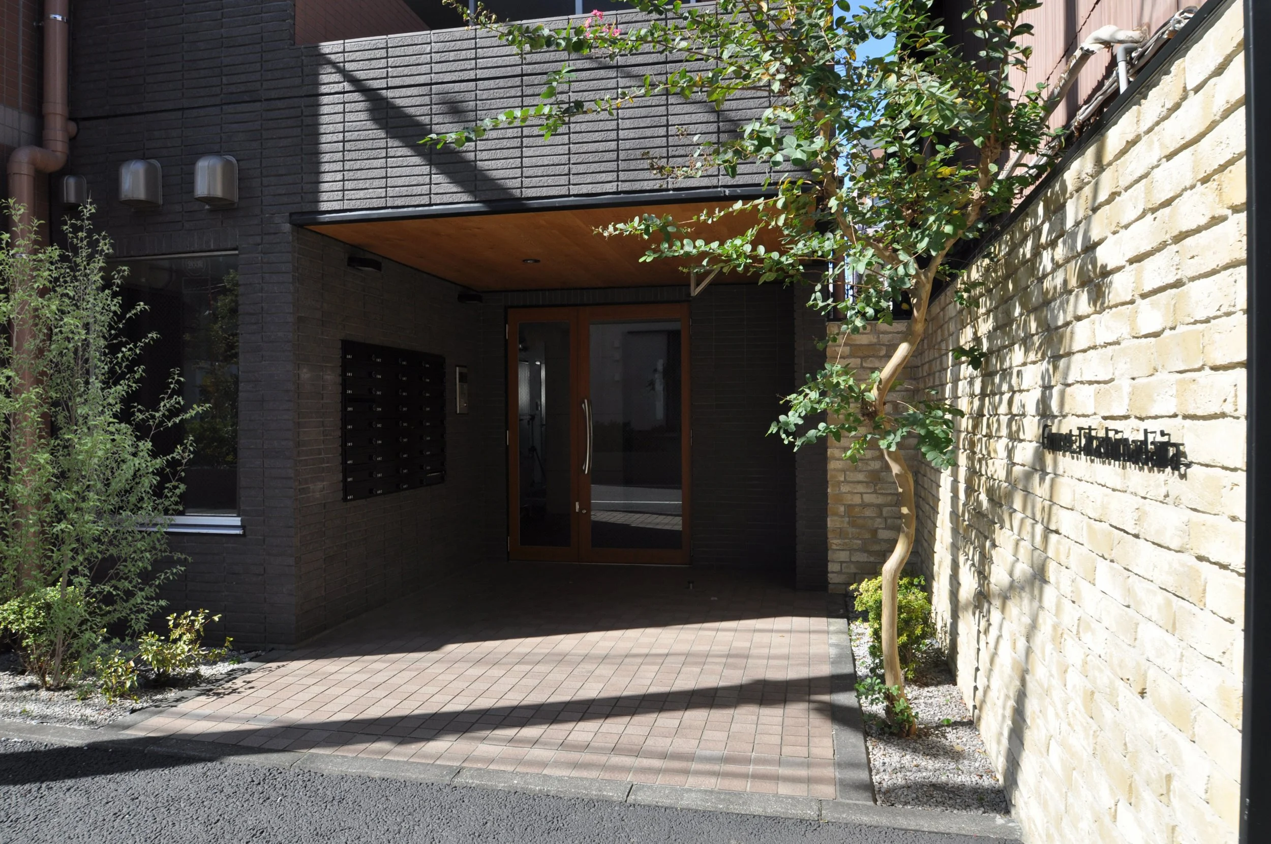
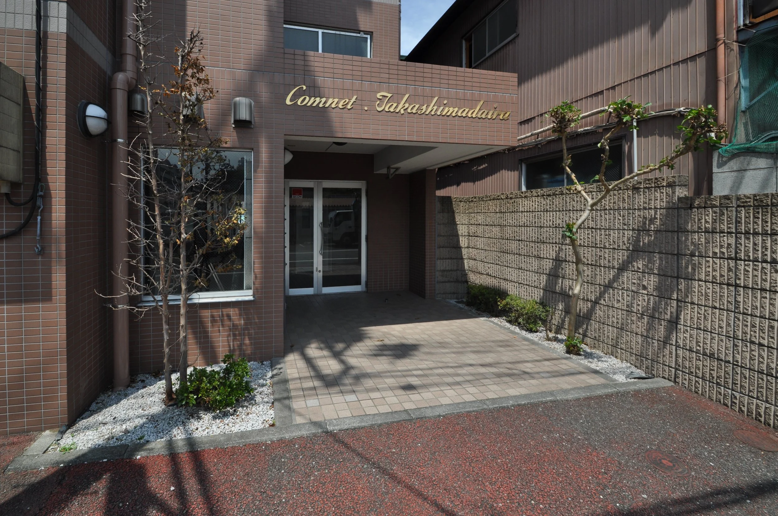
特に、アプローチに面したコンクリートブロック塀やエントランス扉、ポストまわりには破損や老朽化が見られ、外構の植栽も枯れたまま残されていたことで、建物全体として清潔感に欠ける印象を与えていた。
本計画では、限られた予算の中で内覧時の第一印象を改善することを目的に、建物外観、エントランス、共用部まわりを中心にリニューアルを行い、物件全体の印象向上を図った。
This project was a value-up renovation for a student apartment building in Itabashi, Tokyo.
While the interiors had been kept in relatively good condition through restoration work carried out when tenants moved in and out, the building had not undergone any major renovation since its completion. As a result, age-related deterioration was visible on the exterior and in the common areas.
In particular, the concrete block wall facing the approach, the entrance door, and the mailboxes showed noticeable damage and aging. The exterior planting had also been left withered, giving the building as a whole an impression that lacked cleanliness. Within a limited budget, the project focused on renewing the building exterior, entrance, and common areas in order to improve the first impression during property viewings and enhance the overall image of the building.
What I did
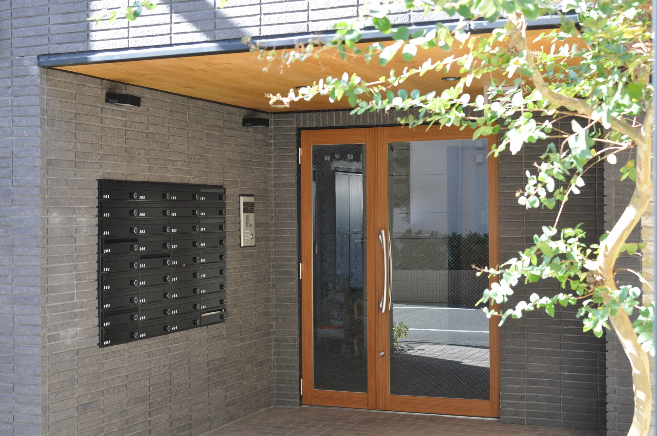
限られた予算の中で効果的に共用部のバリューアップを行うため、まずは玄関扉やポストなど、機能面・印象面の両方に関わる部分を優先して更新した。
それ以外の部分については、不要な要素を整理し、仕上げの凹凸や見え方をできるだけシンプルに整えることで、建物全体がすっきりと見えるように計画した。
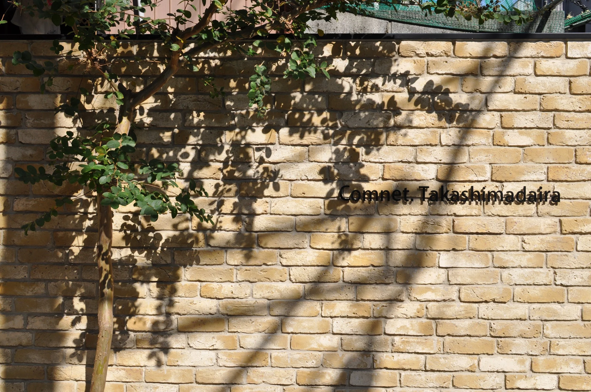
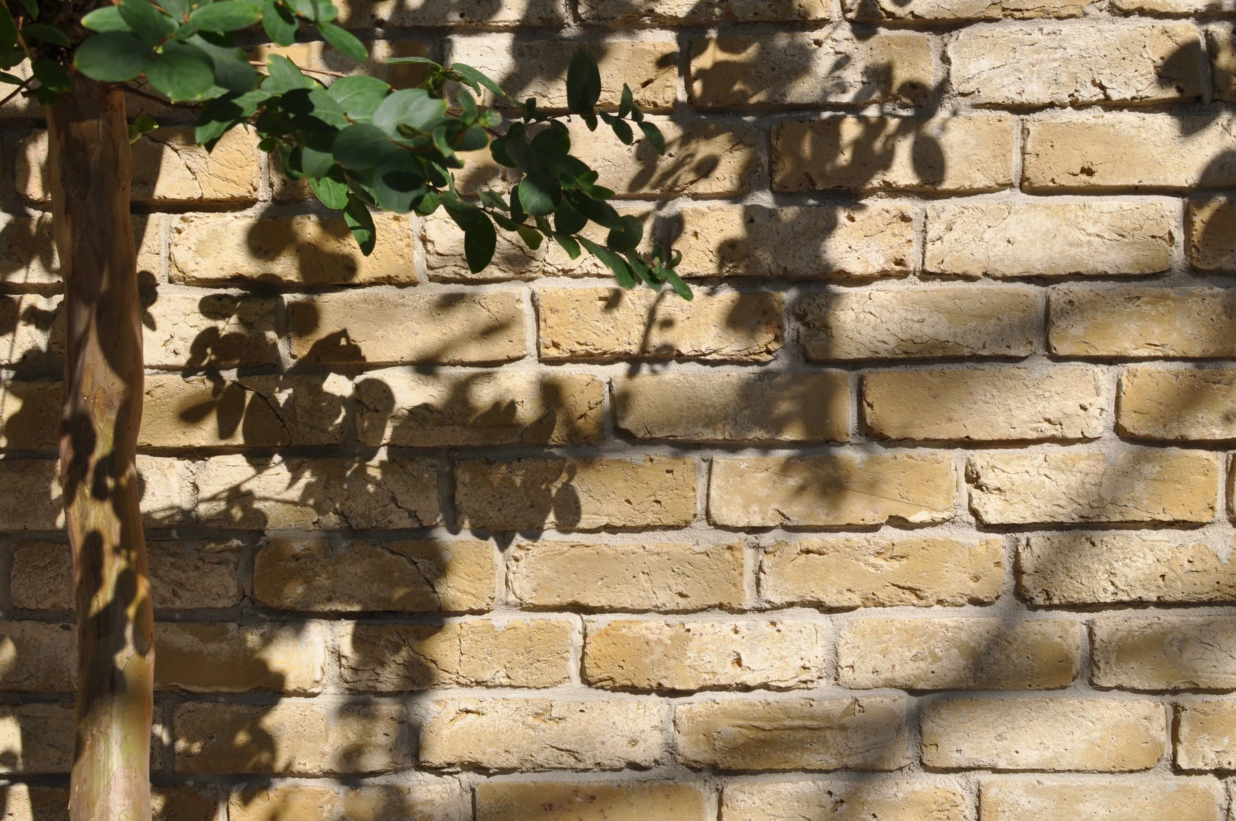
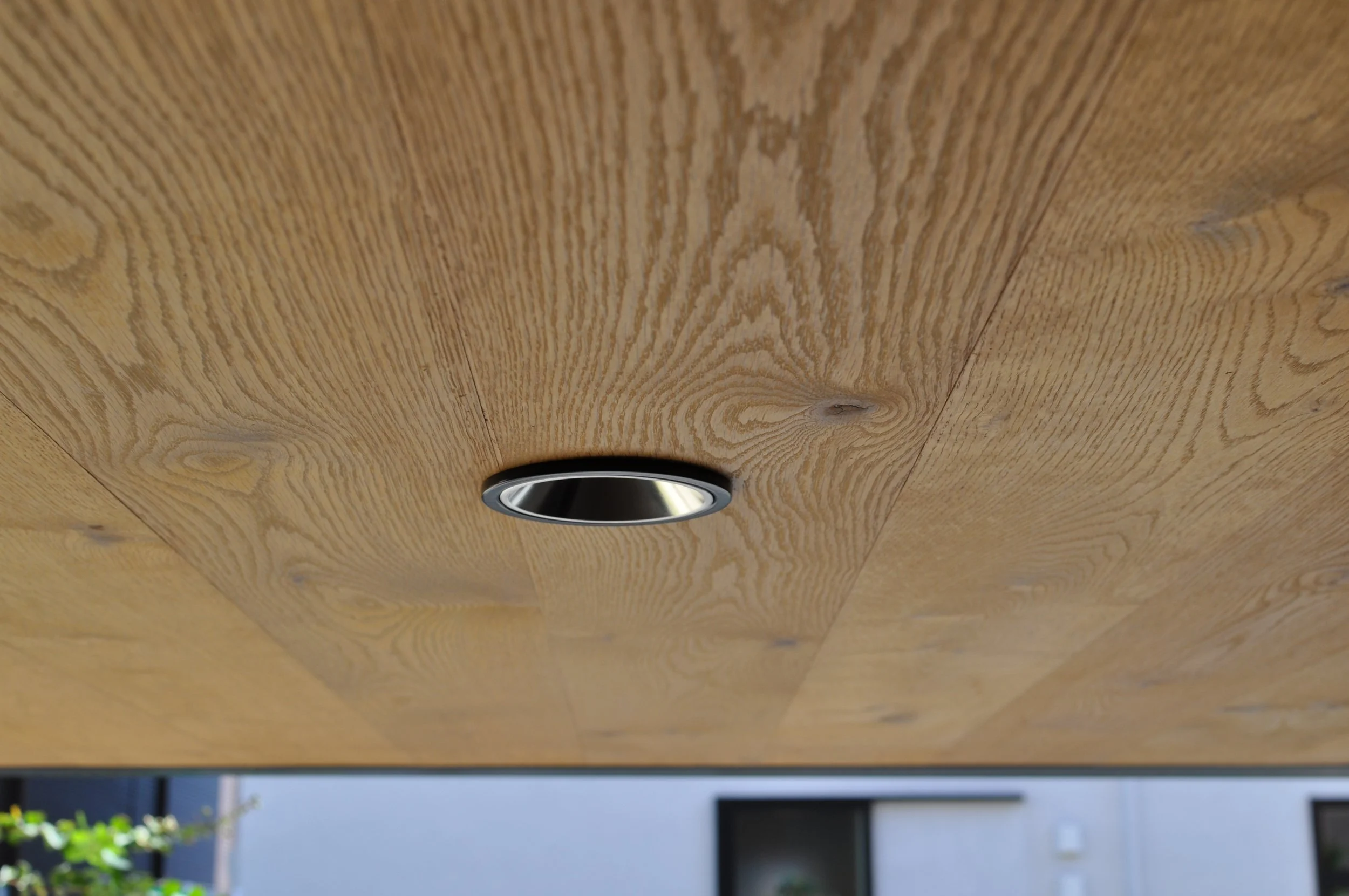
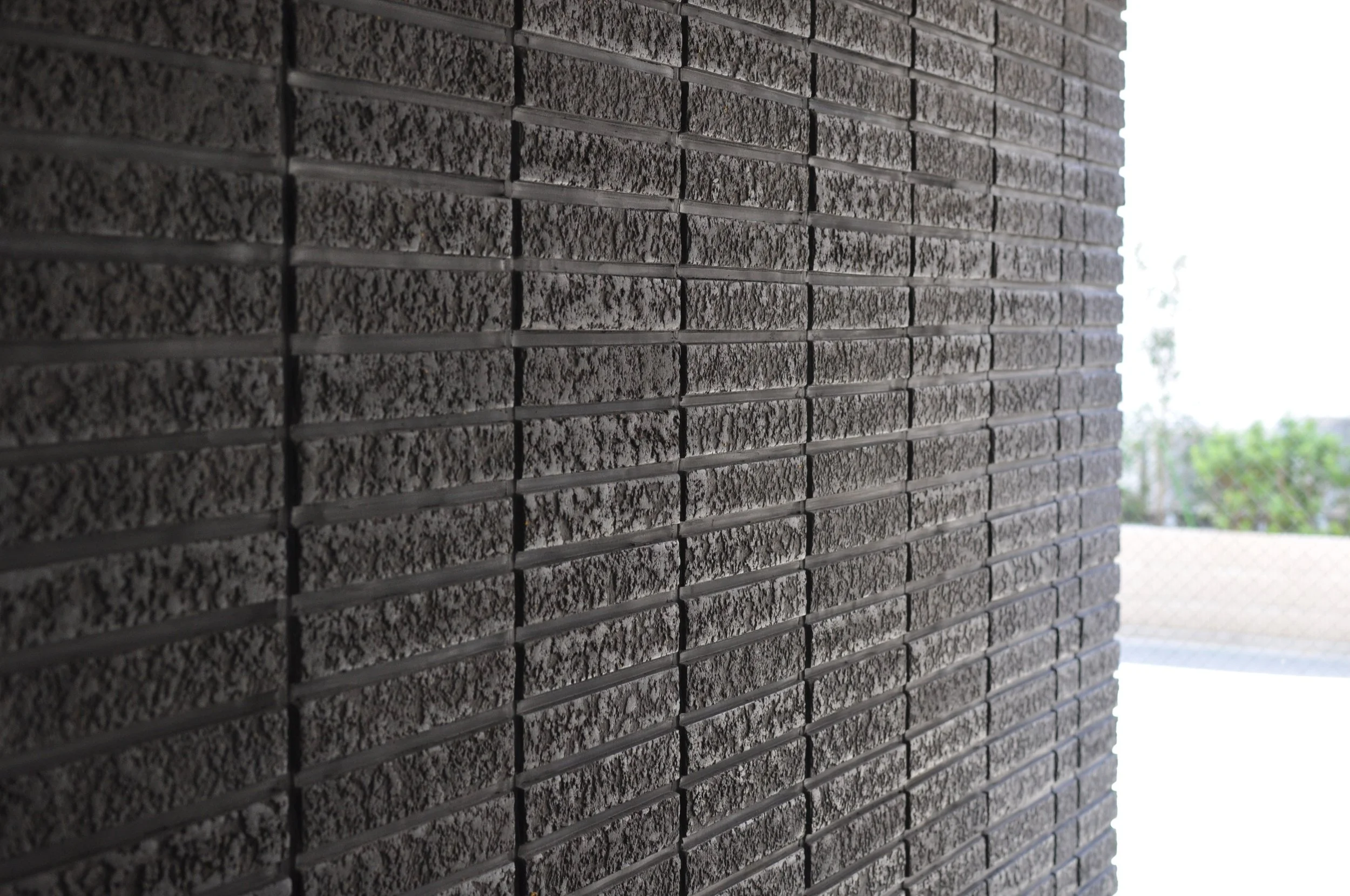
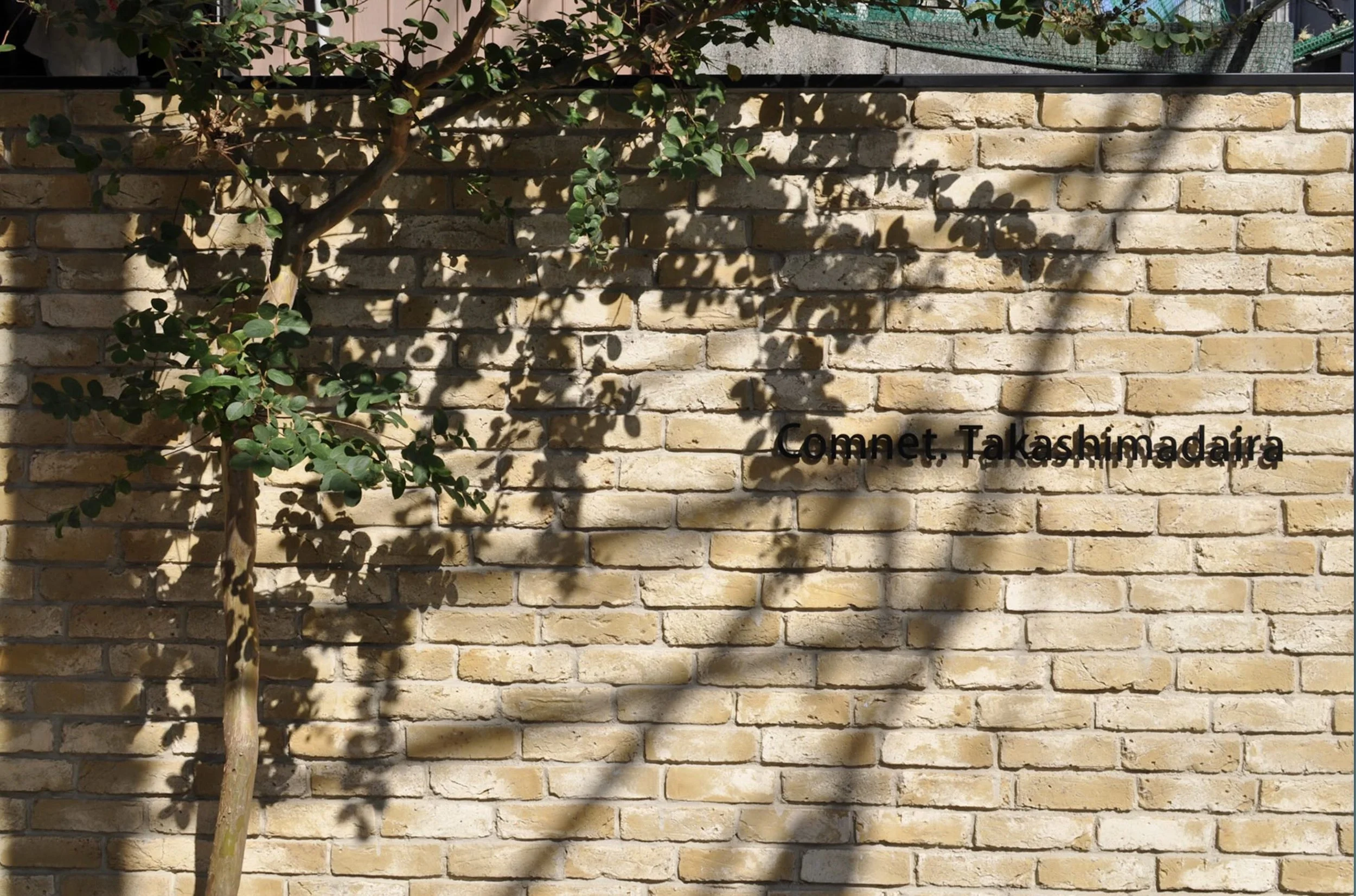
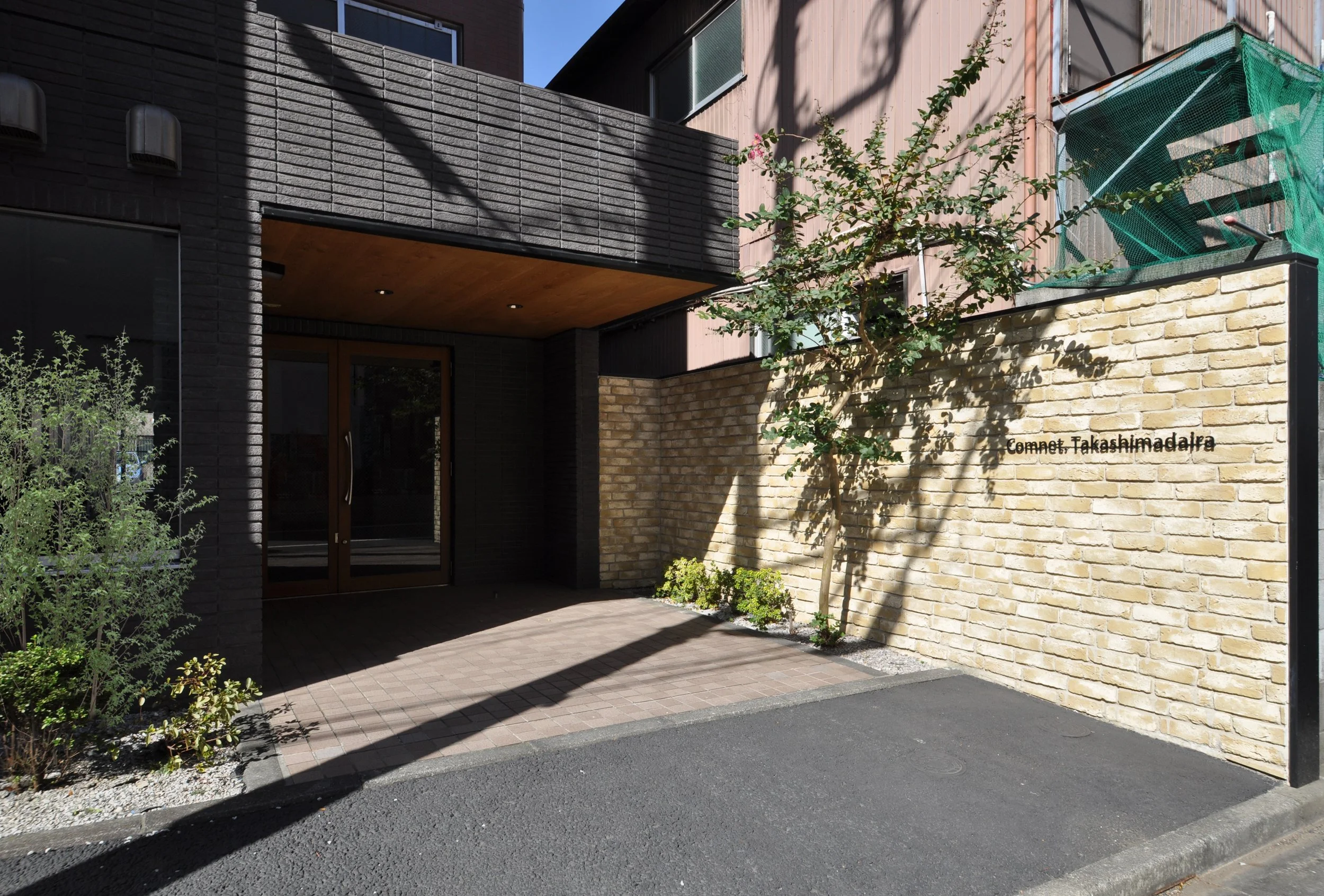
また、アプローチから正面に見えるコンクリートブロック塀を、単なる既存塀として扱うのではなく、建物の印象をつくるアクセントウォールとして活用した。あわせて、これまで2階のパラペットレベルに設置されていた建物サインをアイレベルまで下げ、小さく洗練されたデザインへと変更することで、通りからの見え方を整えた。
最小限の工事範囲でありながら、外観・エントランス・共用部の見え方を総合的に見直すことで、内覧時の印象を大きく改善した。
リニューアル後3ヶ月以内には、もともと6割程度だった稼働率が9割以上に改善されるなど、賃貸住宅としての価値向上にもつながった。
To effectively improve the common areas within a limited budget, I first prioritized the renewal of elements that affected both function and appearance, such as the entrance door and mailboxes.
For the other areas, I focused on removing unnecessary elements and simplifying the surfaces by reducing visual unevenness and excess detail, creating a cleaner overall impression of the building.
The concrete block wall visible from the approach was treated not merely as an existing wall, but as an accent wall that would help define the building’s impression. In addition, the building sign, which had previously been placed at the second-floor parapet level, was lowered to eye level and redesigned as a smaller, more refined element, improving how the building is seen from the street.
Although the construction scope was minimal, the exterior, entrance, and common areas were reviewed comprehensively, resulting in a significant improvement in the impression during property viewings.
Within three months after the renovation, the occupancy rate improved from around 60% to over 90%, contributing to an increase in the value of the property as rental housing.
Design Direction:橋本健一
Architectural Design : N/A
Interior Design:橋本健一
Landscape Design : N/A
Lighting Design : N/A
Construction:Unkown
Photography:橋本健一
※前職での実績
Before
After